Data gets more individual than ever
In addition to design for its related products, a recent project for a Fortune 50 company also needed layers of documentation in order to prove its profitability and efficacy to internal and external stakeholders.
The ongoing challenge was to both tap and demonstrate its capacity to deliver unprecedented—and relevant—machine intelligence. Enabled by a battery of machine learning models, the SaaS solution combines a vast range of data types in novel ways to surface insights that are truly individual.

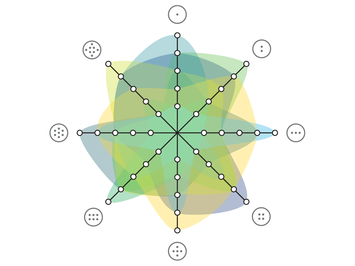
Icons have been replaced with abstract symbols to honor IP.
Over a series of conversations with leadership discussing concepts and planned architecture, I researched the markets and supporting data science theories to better understand the context.
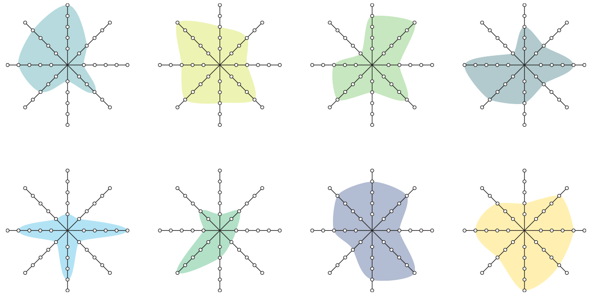
Shown above is an anonymized set of visualizations that depict a range of different individuals. The variety of distinct shapes provides a quick picture of what qualities or set of qualities characterize each person’s unique needs and preferences. A viewer can then dig deeper into specifics, depending on their level of interest.
Each spoke represents the degree of an individual’s likely behavior and statistically derived affinity.
This approach worked because scoring for each dataset followed the same five-point system.
Because there had also been discussion about population-level learnings, I wanted to see what insights might be revealed by combining all eight individuals and adjusting the layer filters (in Adobe Illustrator) to enhance different contours. I have found that experiments like this will successfully anticipate future discussions and needs. I may get blank looks when I first introduce something like this, and then receive an urgent request for it a month or two later.