ux/ui: Beyond omnichannel is omniscience
Before ChatGPT caught the imagination of the public, our Venture Accelerator team with Deloitte was applying multiple machine learning models to combine an unprecedented array of retail insights into a single, powerful, and proactive solution to address pressures ranging from aggressive competitors to volatile supply chains.

The initiative
A sophisticated backend augmentation to retailers’ existing technology, the solution not only facilitates proactive all-channel presence both for internal operations and consumer facing environments, but is also built to adapt to evolving technologies and circumstances.
For customers, the seamless and hyper-intelligent service meets them wherever they are, beyond multi-channel, and even beyond omnichannel outreach, to omniscience.
My role was multifaceted, and included:
translating the project vision into explanatory and/or persuasive imagery and copy
designing flows and UIs for customer-facing and internally-facing apps
advocating for users, balanced with
meeting stakeholder requirements
meeting the requirements of current and emergent platforms (e.g. smart cars)
designing data visualizations to demonstrate efficacy
The portal app
While the customer-facing product is a fully functioning demo (with a mock brand!) to showcase how the solution can be integrated into retailers’ existing ecommerce experiences, the internally-facing app is a command center, or portal. It’s designed for pliability, to grow with the product roadmap and adapt to shifting technologies.
More than simply a dashboard, it provides a meaningful view into the solution’s gathered and processed learnings—as well as ways to interact with them—and can be used by both corporate office and in-store decision-makers as appropriate.
Hurdles and opportunities
When the time came to get started, it hadn’t been decided how the portal app would be implemented, so we aimed for best case. Once we knew what tools would be used and their limitations, we made the necessary adjustments.
The design process was highly collaborative. This was one of many facets of the project where each review revealed new hurdles and new opportunities. Leadership was of course highly invested in demonstrating the technology’s accuracy and efficacy, while I was also committed to ensuring that every component displayed meaningful, easily absorbed information.
The company is understandably a highly risk-averse culture and release 1.0, with its first round of features, was initially designed and developed during the pandemic. For those reasons, the primary research resource was video footage of senior decision-makers discussing frustrations, aspirations and pressures they and their companies are currently facing. Their frank conversations, combined with a few (masked) chats I was able to have as pandemic restrictions eased, provided a valuable qualitative framework across the spectrum of our target audience.
The process
My focus throughout has been to design and deliver a service that keeps technology’s promise—improved, and genuine, relationships between businesses and their customers and freedom for businesses and individuals to explore, create and grow.
It’s probably not news that the steps were less linear than a list makes it look. They overlapped and occasionally backtracked as I explored approaches:
UX research (described above, in addition to further reading)
Aesthetic/cosmetic research into new stylistic trends for the dashboard concept as well as a review of Deloitte’s brand guidelines as they would apply to this project
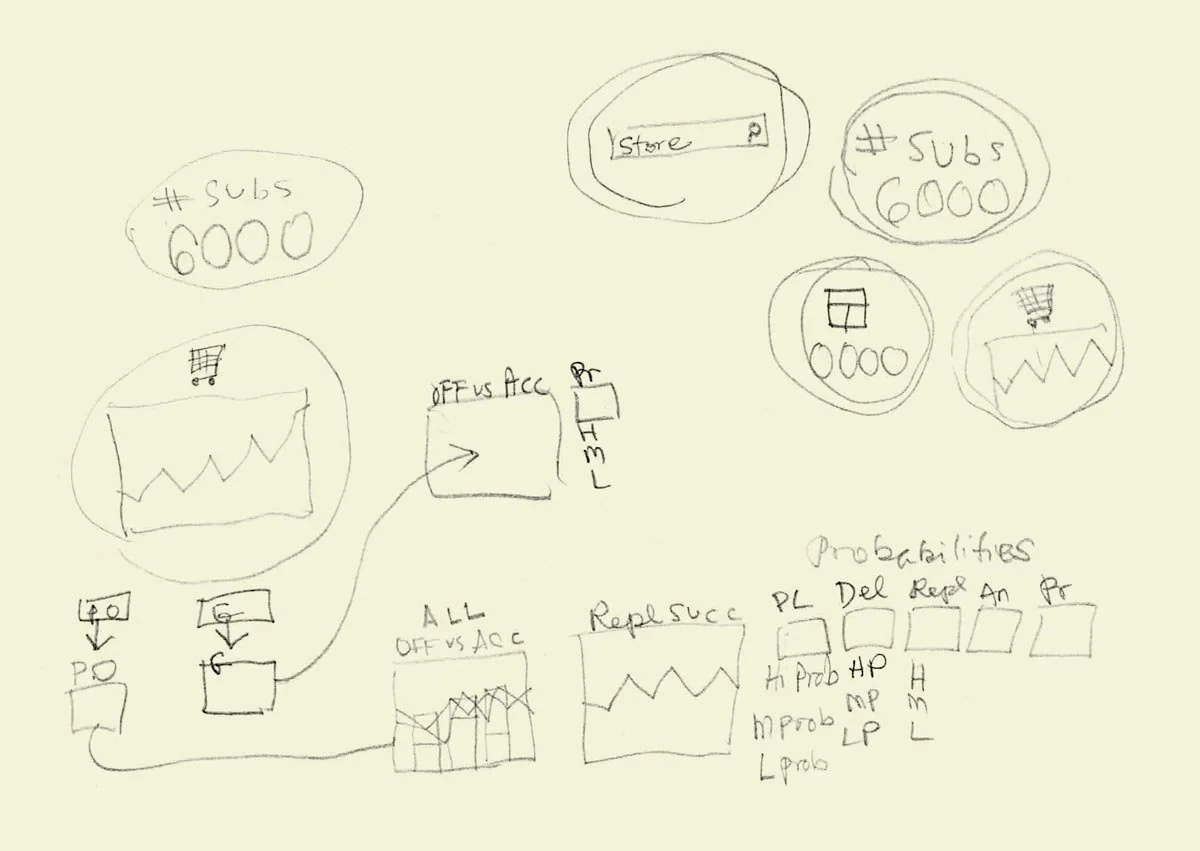
Loose pencil sketches to explore flows, perceptual logic, data visualization options, etc.
Tighter wireframes to distill ideas
Presentation wireframes implemented in a rapid prototype framework
Reviews/revisions
Documentation begins about here
Styling/reviews/revisions
Final asset organization and documentation for handoff
Handoff
Dev reviews/revisions
Launch
Example wireframes
The wireframes below display the essential, abstracted thinking behind each of the experience areas while honoring my employer’s privacy.
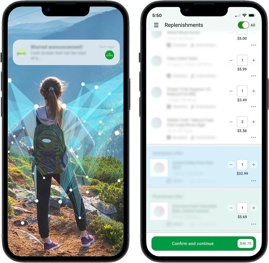
I was most excited about this section of the app, since it is where clients can directly interact with and experience the power of the technology. By feeding it their own data and entering their preferred parameters, they can tap its real-time and continuously augmented learnings for their own specific needs.
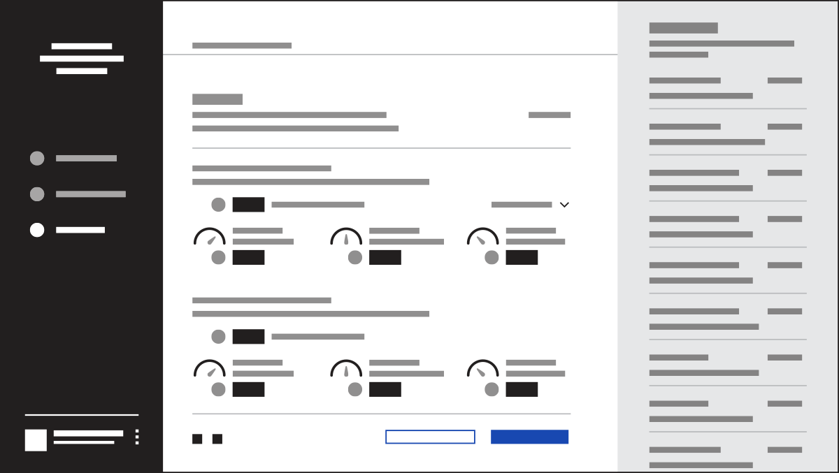
Shown above is the layout for projected results based on the client’s parameters and, to the right, a running session history so that previous projections can be reviewed if desired. These results provide enough detail for informed refinements to be made to the plan, and the design leaves room for future features to enrich the projections and interactivity as they become available.
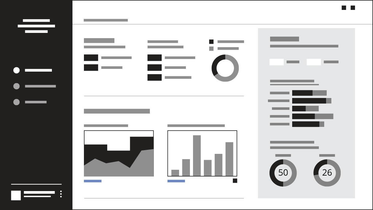
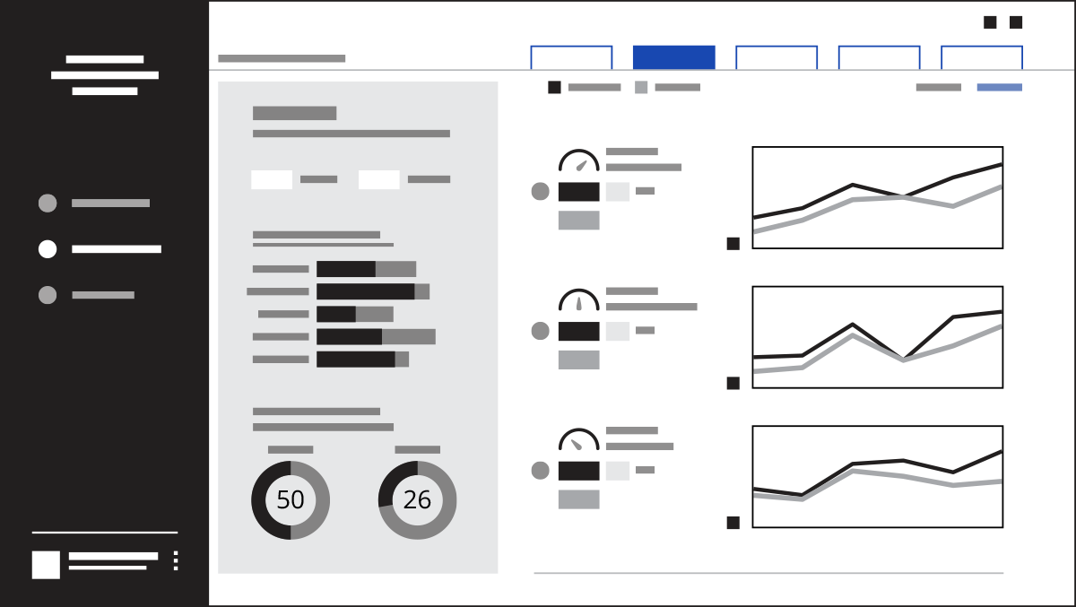
B2B portal landing page
The portal’s landing page provides a high level view of performance metrics. Data in the gray box at right is categorized, but still shows a higher level view.
Performance details drill down into individual categories.
Performance details break down the information for each category, while still keeping the bigger-picture numbers (in the gray box) at hand. Within each category, further subcategories give more granular insight.