GenAI, UI, and UX
One of the questions I ask myself when we’re initiating a new application is, “When I strip down the objectives to their plainest language, what is the essence of the problem we’re solving?”
User interface and experience design is, at heart, how we help a person make practical use of technology, whether it’s shopping for groceries or determining whether to escalate a security incident. People usually don’t need to spend time appreciating their app’s cool technology. With the proliferation of GenAI functionality, none of that changes.
In my recent design work for a powerful GenAI-augmented dashboard application, the task at hand was still what mattered most, not a chatbot. A conversational assistant needed to be available, but not a dominant presence.
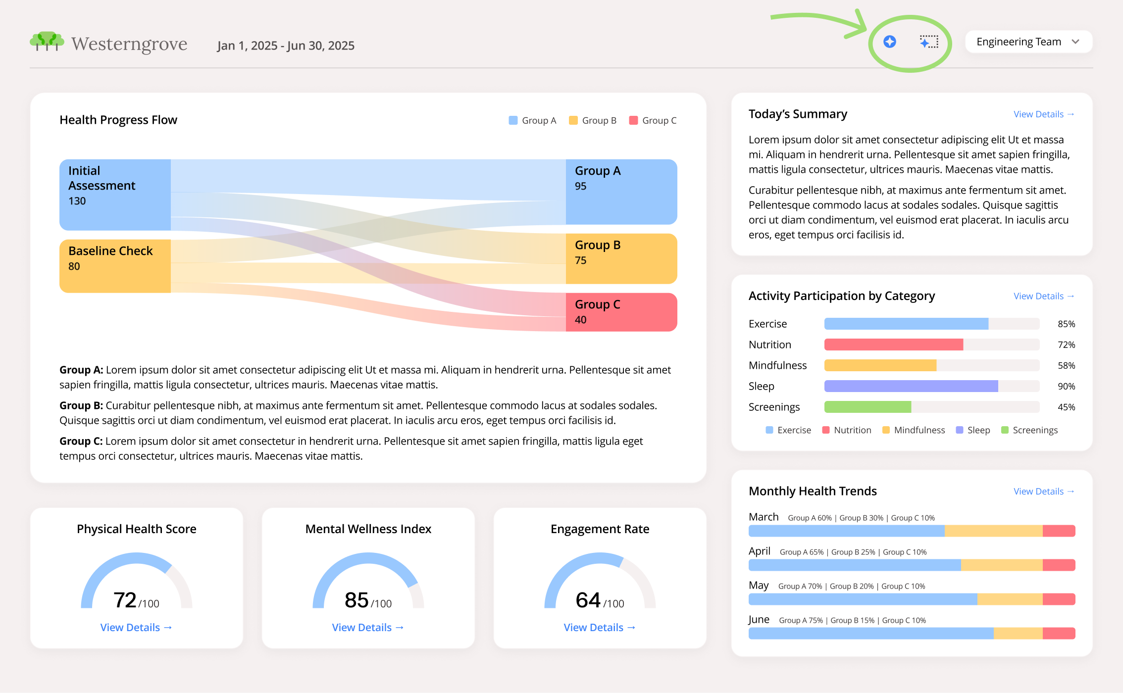
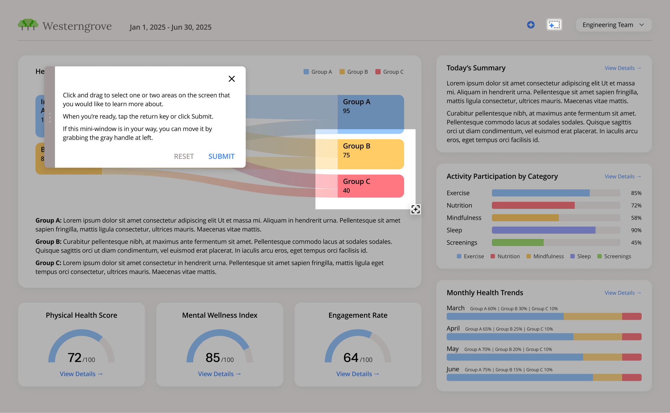
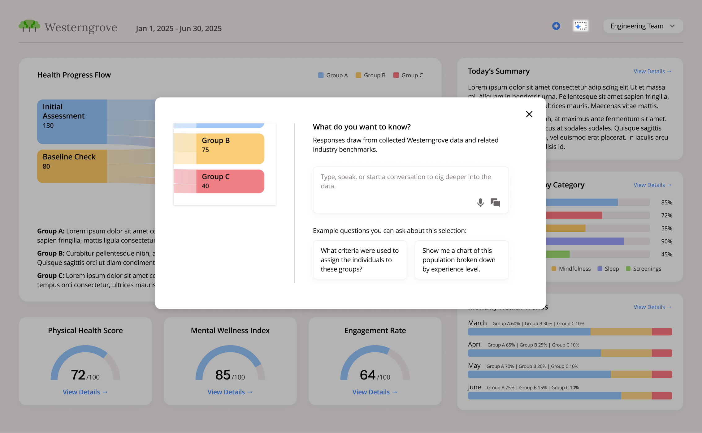
What’s more, while text is useful, it’s not always the most natural affordance. People have different ways of processing information. Why make everyone translate what they’re looking at on the screen into words when it might be easier to just point to it? A multimodal interface can give visual thinkers (who are not just designers) a much more direct interaction path. By selecting an area on the screen, for example, the first part of the prompt has been handled.
Scroll through the slides below to view the Smart Select concept (Westerngrove is a fictional company).
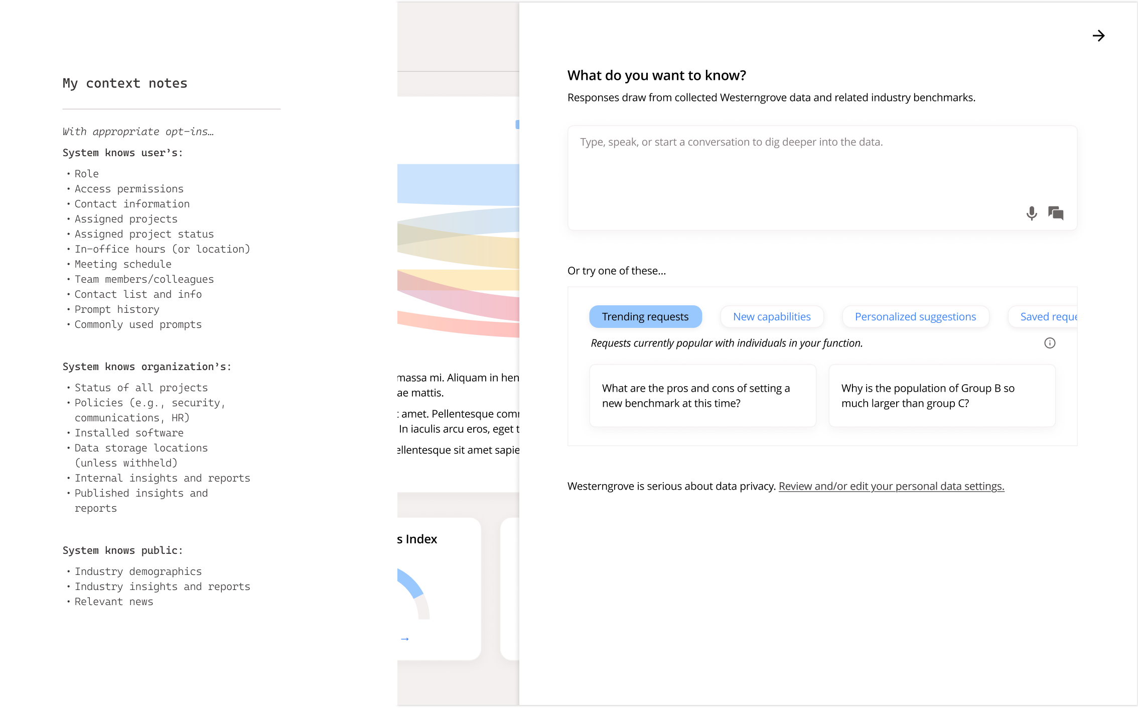
Then, once the interaction has begun, how do we deliver the context—what the system knows (with appropriate permission)—so that it’s useful and relevant?
This question is what led to the design below. Below left is the context list I created and referred to while thinking about how to present it and its potential in a way that would be coherent and actionable.
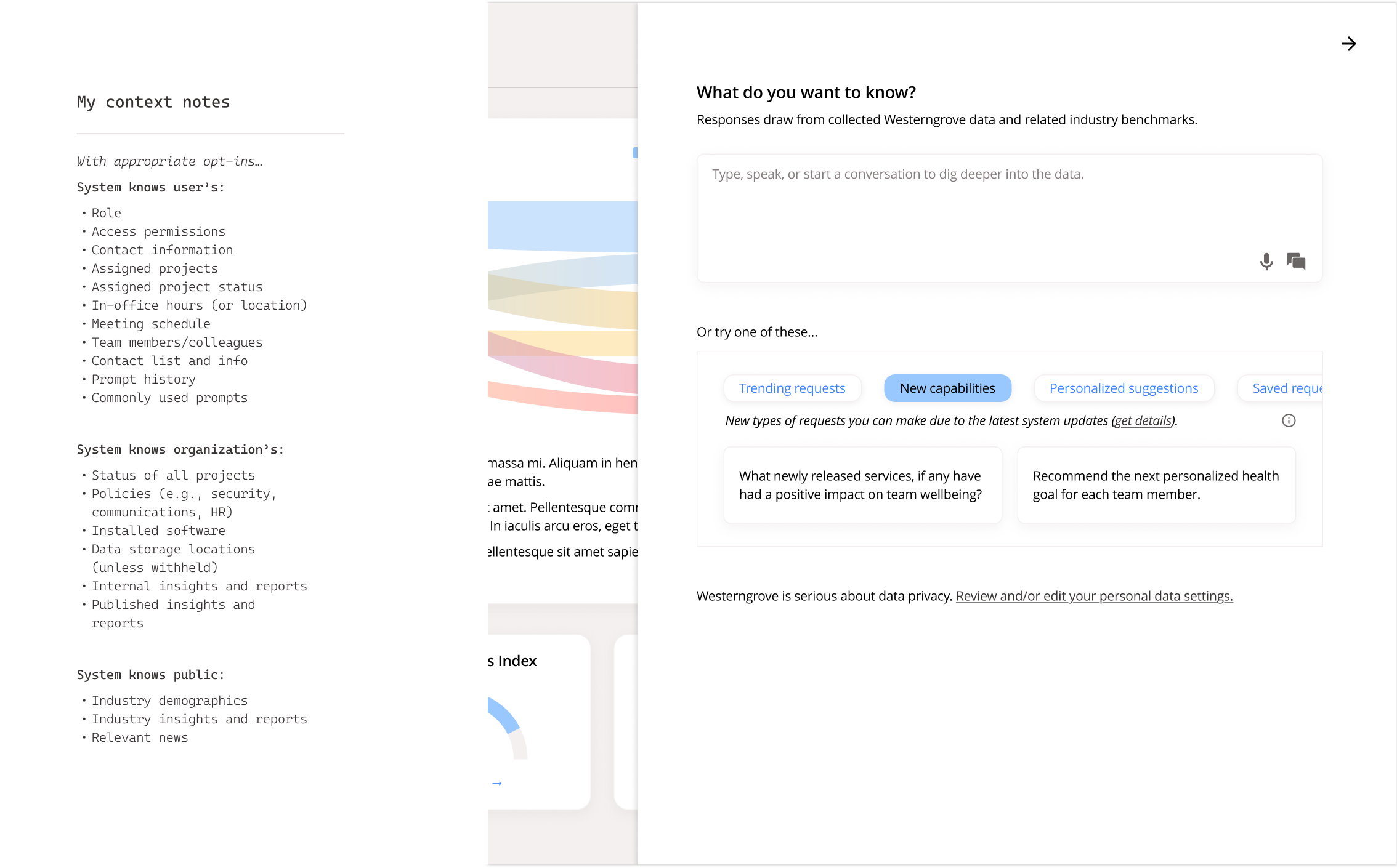
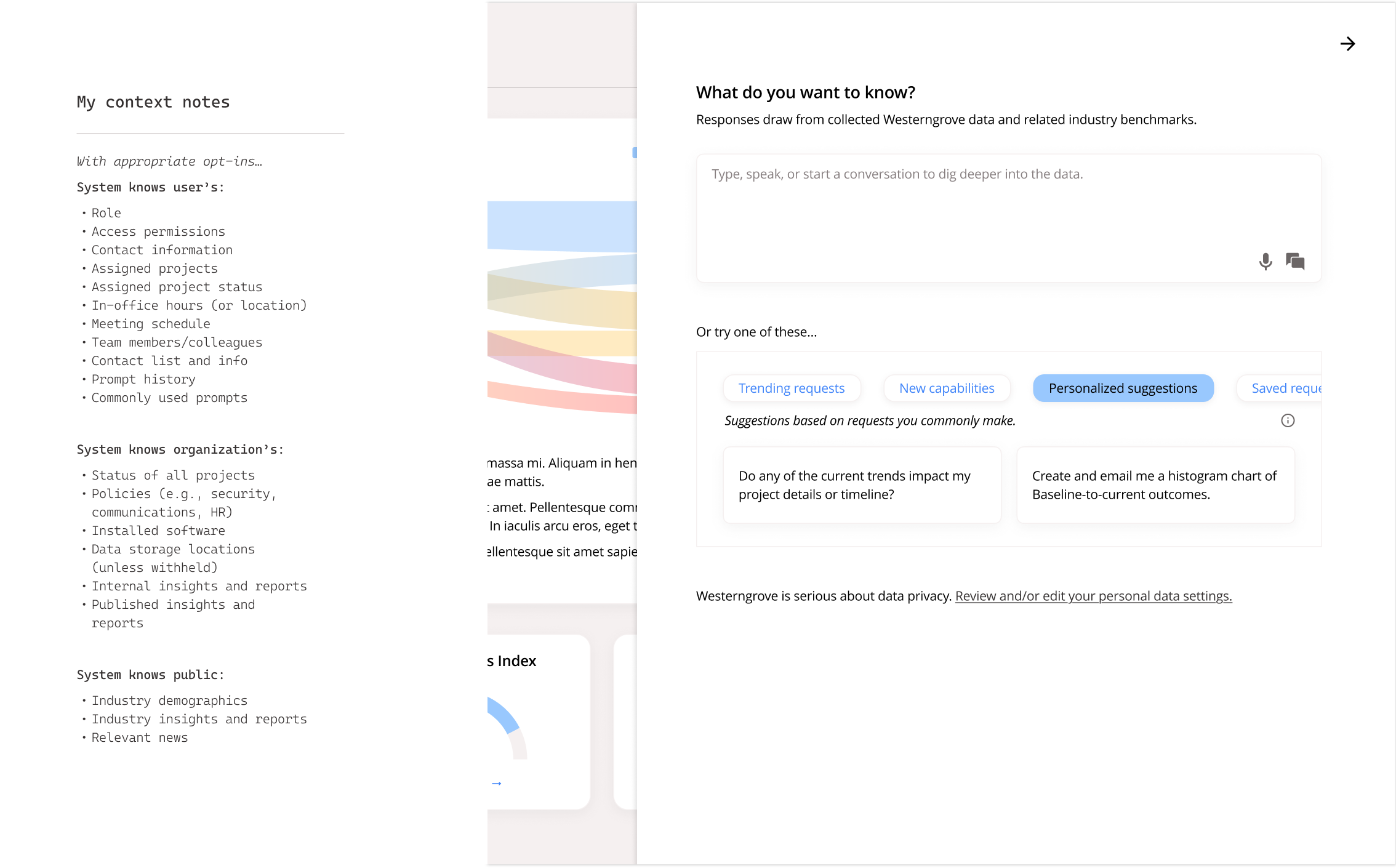
I pay a lot of attention to task flow. While some friction actually supports flow, even a little red underline or floating toolbar (especially when it obscures part of what you’re focused on) could be demanding your attention without real sensitivity to what you need or want in that moment. The solutions here join a larger conversation around design that focuses past the shiny new tools to this gold standard: what people can accomplish with them.
Since the original project is not shareable, I created a generic dashboard for Westerngrove, a fictional company with a fictional use case, mostly using Figma. I created and fed specs to its chat tool to generate a couple of basic dashboard concepts, then refined one of those and built out the rest of the interfaces.
Full disclosure: As I put together this post, I saw a few areas for improvement and updated the design to reflect those insights.